Discover
Stakeholder interviews, audience research, competitive and category audit, and a hard look at where the current brand helps or gets in the way.
Brand strategy & development 06
A name, a logo and a color palette aren't a brand. We build the whole system: positioning, naming, visual identity, voice, and the brand book that keeps it consistent, so your institution reads as credible the first time someone meets it, and the hundredth.
The discipline 01
We work with brands whose identity carries weight: restaurants and food-service groups, hospitality and destinations, public agencies, universities, certifying bodies and mission-driven institutions. For a restaurant the bar is just as high: the brand has to read on a sign at 40 feet, on a phone screen at the table, on a delivery-app tile, on the menu, and on the patio, and still feel like one place.
So we don't just make something that looks good in a deck. We build a system grounded in research and positioning, vetted for trademark and cultural fit, and documented so cleanly that anyone on your team (your kitchen and front-of-house staff, a franchisee, a vendor or a regional office) can use it correctly without us in the room.
Talk through your brand →The shape of a brand engagement at Zoned Marketing
A note on attribution: the spend figure reflects the portfolio our founders and senior team led during prior agency tenures. We present it as the experience you'd be hiring, not as a Zoned-the-company client metric.
What we build 02
Every piece reinforces the next: positioning informs naming, naming informs identity, identity informs the book, the book keeps it all consistent in the wild.
Who you're for, what you stand for, and the line that makes the difference clear. Research-backed, not invented.
Names you can actually own, screened for trademark, domain, linguistic and cultural conflicts before you fall in love.
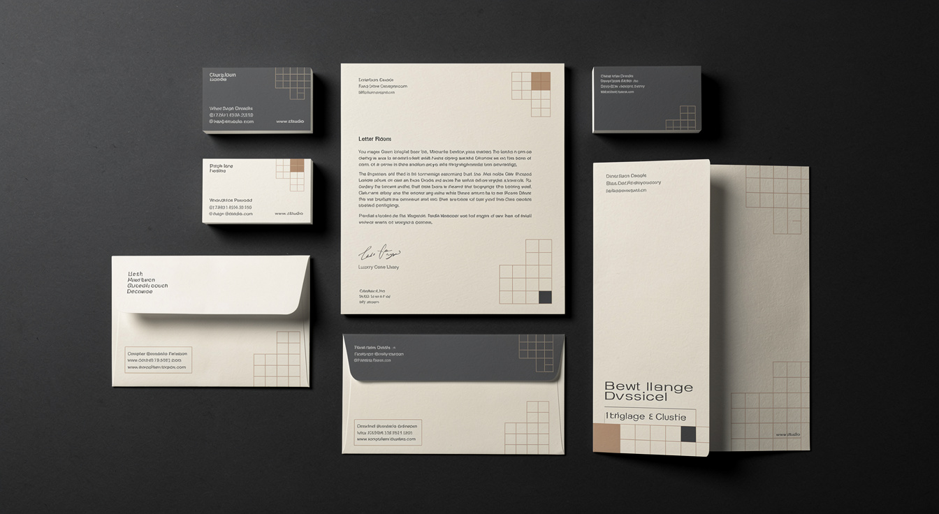
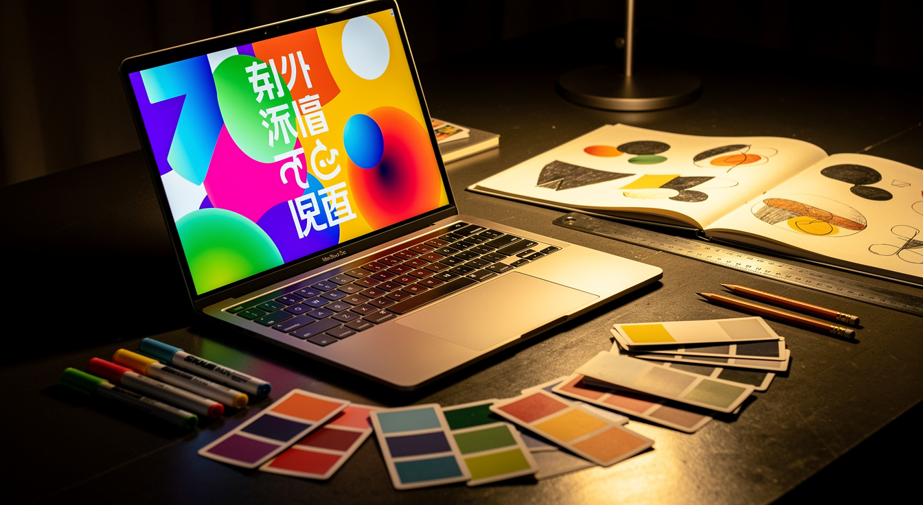
Logo, color, type, grid, iconography and motion: a flexible system, not a single locked-up mark.
The reference that keeps every team and vendor on-brand: usage, do's and don'ts, accessible color pairings, real examples.
How you sound in a headline, a form field and a crisis statement. A voice your whole org can write in.
Brand in the physical world: environmental graphics, signage systems and wayfinding that read clearly at a glance.
Our methodology 03
A name for a public program, a place or an institution isn't a creative exercise; it's a civic one. Get it wrong and you spend years on damage control. Our Community-Centric Naming & Branding methodology brings the people who'll live with the name into the process, so the result earns ownership instead of resistance.
 Listen → vet → validate → document
 Name → mark → system → book
Naming & clearance 04
Falling in love with a name before you clear it is how brands end up rebranding eighteen months in. We generate names against a defined strategic territory (built from archetypes, value and personality, not a thesaurus), then put every serious candidate through the same gauntlet before it ever reaches a board or a wall.
We hand you a shortlist with the homework already done, so the conversation is "which of these do we love," not "can we even use this."
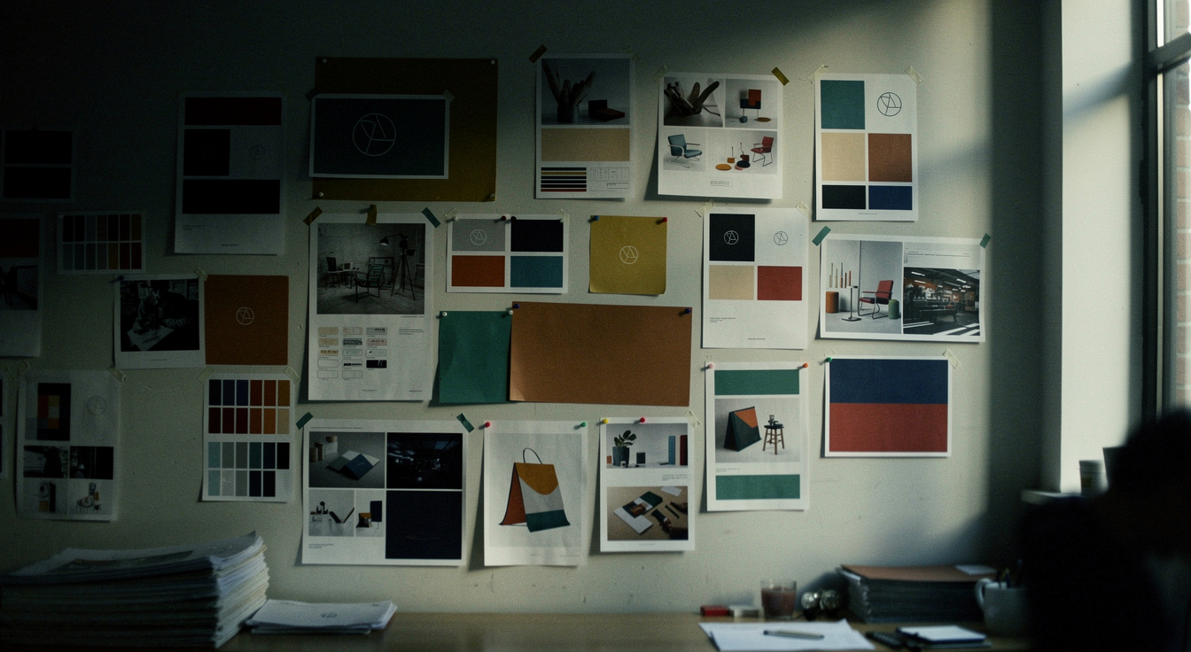
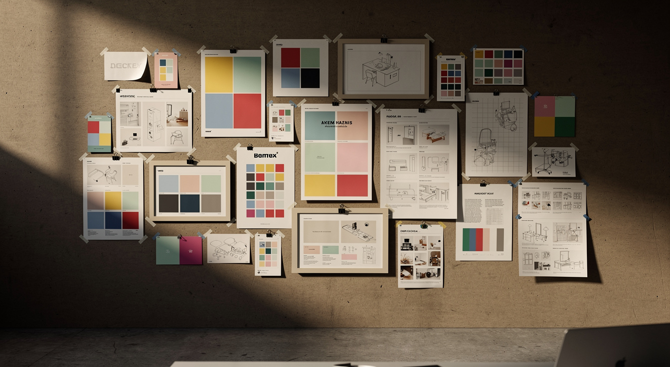
Visual systems 05
A logo is one expression of a brand. The hardest-working ones live in dozens of contexts at once, so we design the whole kit of parts and the rules that govern it, then prove it on the surfaces that matter before we ship.
Primary and responsive marks, color with accessible pairings, type scale, grid, iconography, imagery direction and motion. Built to flex from a favicon to a building.
We pressure-test the identity on real touchpoints (signage, social, collateral, menu, app tile, storefront) so it holds up at 40 feet and on a 5-inch screen.
How the brand sounds in a headline, a form field and a crisis statement. A messaging framework your whole org can actually write in.
It all lands in a brand book detailed enough that a franchisee, vendor or regional team stays on-brand without us in the room.
 Mark · color · type · grid · motion
 One place: sign, screen, menu, patio
Restaurants & hospitality 06
Hospitality is the hardest place to be inconsistent and the easiest to get caught. The same identity has to land on a sign at 40 feet, a delivery-app tile, a QR menu at the table, the patio, the to-go cup and the Instagram grid, and still feel like one place with one point of view.
We build restaurant and hospitality brands as operational systems, not just pretty logos: a mark that survives signage and embroidery, a palette that photographs well in warm low light, type that's legible on a backlit menu, and templates a busy front-of-house team can run without a designer. It's brand built for the floor, not just the deck.
See our restaurant & hospitality work →How we work 07
No black-box reveals. You see the thinking at every stage, so the final system is one you helped shape and can defend in any room.
Stakeholder interviews, audience research, competitive and category audit, and a hard look at where the current brand helps or gets in the way.
The strategic core: audience, value, personality and the positioning line everything else hangs on. Aligned and signed off before a pixel moves.
Naming, identity, voice and the visual system, designed in directions, refined together, and trademark-vetted so you can actually own what you choose.
The brand book, asset library and rollout guidance, plus wayfinding and templates, so the brand stays consistent long after launch.
Why Zoned Marketing 08
From restaurant and hospitality identity to behavior-change work for public agencies, universities and national certifying bodies, our team has built brands that have to be accessible, accountable and durable for years, and consistent across every menu, sign, screen and storefront. That rigor is the difference.
See work our team has led →Color, contrast and type chosen to meet WCAG, so the brand works for everyone and survives public scrutiny.
We vet for conflicts early. You don't present a name to a board only to find you can't own it.
Brand books detailed enough that any vendor or regional team can stay on-brand without us in the room.
Positioning and research come first. The look is the consequence of the strategy, never a substitute for it.
Works well with 09
A new identity is worth more when it's carried through everywhere it shows up. These are the disciplines we most often pair with brand work.
Bring the new identity to life across ad creative, video, design and brand journalism. Built to scale, not just to launch.
Explore →Translate the identity into a design system and interface engineered for accessibility, speed and conversion.
Explore →Roll the brand out with earned media, thought leadership and behavior-change comms that put it in front of the right people.
Explore →Let's talk 10
Whether you're naming something new, repositioning, or finally giving your identity the system it's been missing, tell us where you are. We'll tell you honestly what it'll take.