UX Research & Strategy
User journeys, information architecture, content modeling and usability testing. We map how people actually move through your product, then design to remove the friction, not to win an award.
Web Experience & UX/UI 04
Most agencies hand you a pretty mockup and call it a day. We design the whole experience: research, journey, interface, and the design system underneath it. We build it mobile-first, accessible by default, and measured against real conversion goals.
The discipline 01
A beautiful interface that nobody can navigate is just expensive decoration. We start with the people on the other side of the screen: the diner deciding where to eat tonight, the guest trying to book a table on their phone. We study what they came to do, what's getting in their way, where they hesitate, and we design every screen to move them forward.
Our Head of Web & Digital Experience has spent nine-plus years shipping full-stack products, with accessibility, GA4, and CMS/CRM in his bones, so design and engineering aren't two departments throwing files over a wall. They're one team, one system, from first wireframe to live, measurable page.
Pairs with Software Development →What we do 02
Engage one piece or the whole thing. Either way, senior people do the work, and every decision ladders up to a number you care about.
User journeys, information architecture, content modeling and usability testing. We map how people actually move through your product, then design to remove the friction, not to win an award.
Interface design that's clean, on-brand and genuinely usable. Layout, type, color, motion and state are crafted in high fidelity and handed off ready to build, never lost in translation.
We design for the smallest screen first, where most of your traffic actually lives, then scale up. Fluid layouts that feel intentional on a phone, a tablet and a 27-inch monitor alike.
Funnels, form design, friction audits and A/B testing. We treat every page as a hypothesis and let the data settle it. A shorter form on the CFP Board funnel our team led completed at 94% versus 66%, helping cut cost-per-lead by 650%.
Reusable component libraries, tokens and documentation that keep every page consistent and every future build faster. One source of truth your design and dev teams can both trust.
Accessible by default, not bolted on at the end. Semantic structure, keyboard paths, contrast and screen-reader support: the standard public-sector and regulated work demands, on every project.
Inside the work 02b
Here's how a Zoned Marketing engagement actually moves: what we learn, what we build, and how we know it worked.
We start where the CFP Board and Missouri public-health work our team led started: with people. Stakeholder interviews, analytics and heatmap review, and usability sessions surface where real users hesitate. On the CFP campaign that meant focus groups with college-bound students and their parents before a single screen was drawn, so the interface answered the questions people actually had.
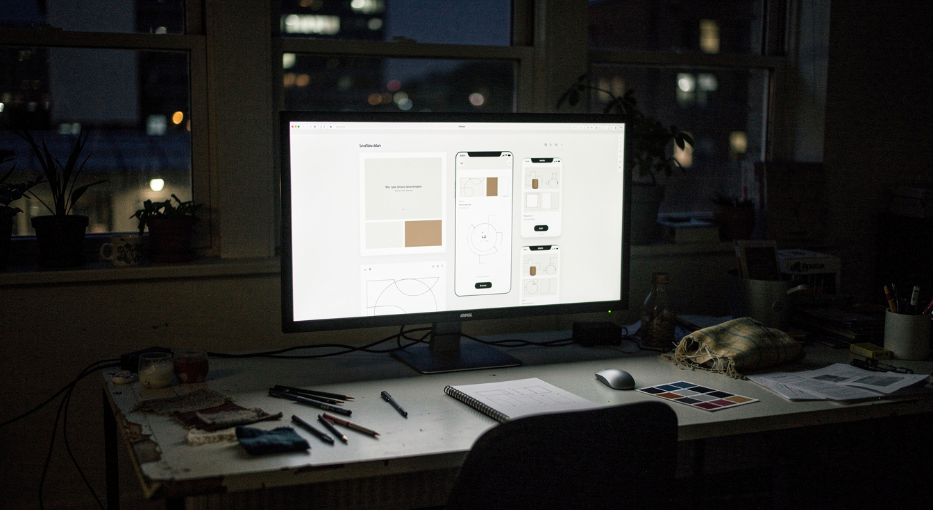
Research becomes information architecture and journeys, then a documented system of components and tokens: type, color, spacing, states and motion. Every page draws from one source of truth, so a seasonal menu and an online-ordering flow feel like the same brand, and your team ships the next page in days instead of weeks.
The same team carries the system into production: semantic HTML, keyboard paths and WCAG 2.1 AA contrast baked in, Core Web Vitals and lazy-loaded media tuned from the first commit. Accessibility and speed aren't a phase at the end. They're constraints the design respects from screen one.
Launch is the midpoint. GA4 events, heatmaps and structured A/B tests keep sharpening the funnel. A shorter, friction-stripped form on the CFP Board funnel completed at 94% versus 66% and helped cut cost-per-lead by 650% year over year.
 Wireframes · IA · component system
Why it matters 03
Good-looking and high-performing aren't a trade-off. Done right, they're the same thing. A clear, fast, accessible experience is what earns trust, and trust is what converts. Here's what that discipline looks like in practice.
See the CFP Board case →Core Web Vitals, lazy-loaded media and lean front-end code. A page that loads in a blink keeps people from bouncing before they convert.
Obvious navigation, honest hierarchy, one clear next step per screen. We remove decisions, not add them.
WCAG 2.1 AA isn't a compliance checkbox — it's a wider front door. More people who can use it means more people who convert.
GA4 events, heatmaps and A/B tests from day one, so the experience keeps getting sharper after launch, not just on it.
How we work 04
No mystery, no black box. You'll always know what we're doing, why, and what it's supposed to move.
Stakeholder interviews, analytics review and user research to find where the real friction and opportunity live.
Information architecture, journeys and wireframes. We get the structure right before anyone touches a color.
High-fidelity UI and an interactive prototype, built on a reusable design system and validated with users.
Our engineers ship it accessible and fast, then we test, measure and refine against your conversion goals.
 Design system · components · tokens
Built to last 05
When the interface is built from a documented system of components and tokens, your brand stays coherent across every page (from the homepage to a seasonal menu to an online-ordering flow), your team ships new work in days instead of weeks, and accessibility and performance are baked into the foundation, not patched in later.
For restaurants and food-service brands that's the difference between a site people browse and one they book, order and come back to: a digital menu that updates in minutes, reservations and online ordering that feel effortless on a phone, and food photography that earns the click. It's the same system-driven approach behind the experiences our team has shipped for national institutions, from financial-certification funnels to statewide public-health campaigns, where consistency, scale and compliance aren't optional.
What gets delivered 05b
When the design and the build come from one team, the system is real: tokens a developer can read, components that behave the same on every page, and a front end that respects accessibility and Core Web Vitals from the first commit. Here's what's actually in the box.
Color, type scale, spacing, radius, motion and state defined once as named tokens. Change a brand color in one place and every button, badge and menu card updates, so the homepage, a seasonal menu and an ordering flow can never drift apart.
Buttons, forms, cards, navigation, modals and media patterns are each documented with their variants and states, built once and reused. Your next page is assembled from proven parts, not redesigned from scratch.
Headings in order, landmarks, labelled forms, visible focus and keyboard paths: WCAG 2.1 AA contrast and screen-reader support baked into the components, so accessibility ships by default instead of being audited in at the end.
Core Web Vitals treated as a constraint: lazy-loaded media, lean front-end code, sized images and minimal blocking script. A page that loads in a blink is the one that keeps a hungry diner from bouncing to the next result.
It's the same system-driven rigor behind the national work our team has led: financial-certification funnels for the CFP Board, statewide public-health campaigns for Missouri DHSS, where consistency, scale and compliance were never optional. See how engineering carries it to production →
 Tokens · components · accessible build
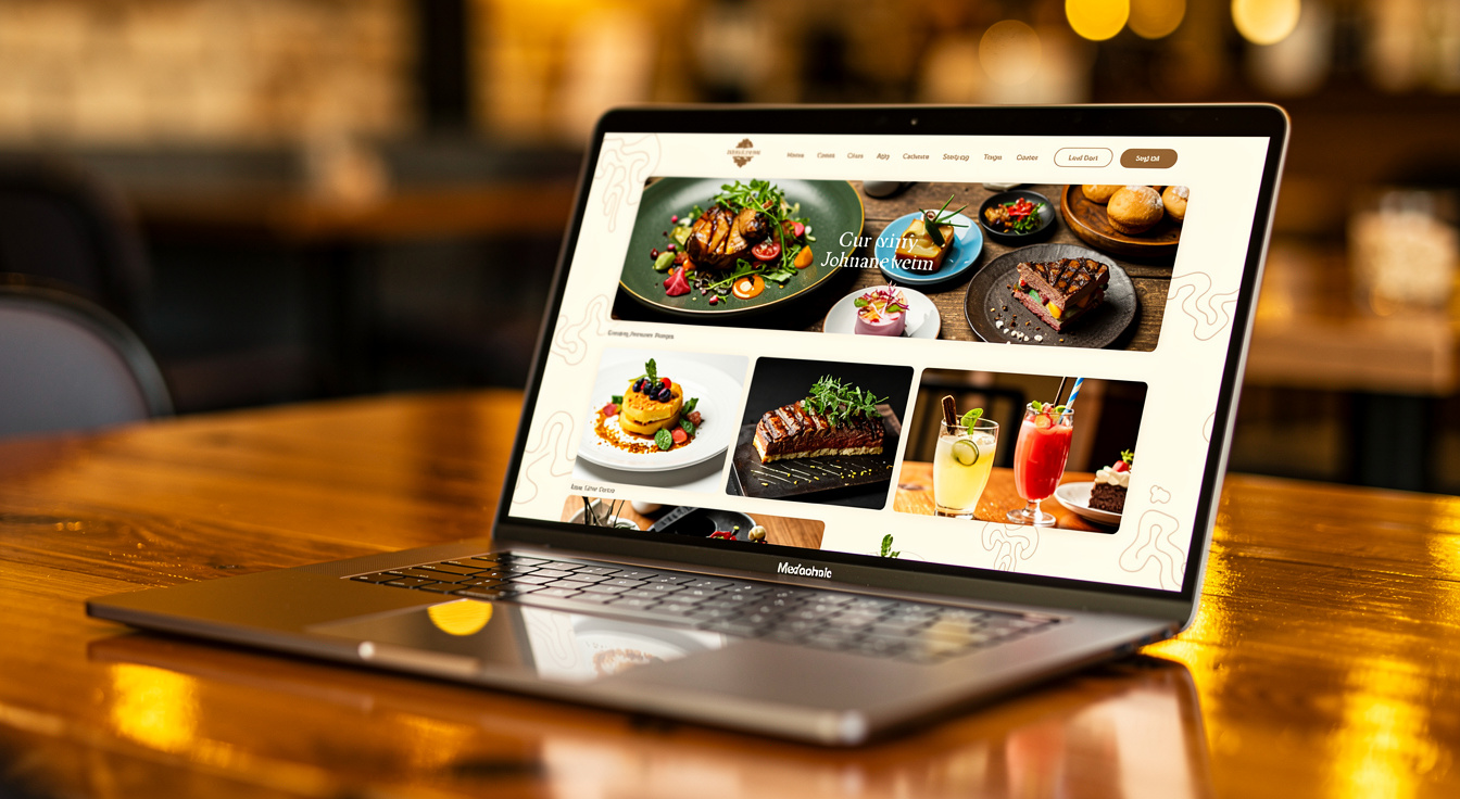
Restaurant & hospitality 06
A diner deciding where to eat tonight is on their phone, hungry, and one slow page from picking somewhere else. Restaurant web experience is its own discipline, and we design for the moments that actually drive a cover: find the menu, trust the food, book or order in a couple of taps.
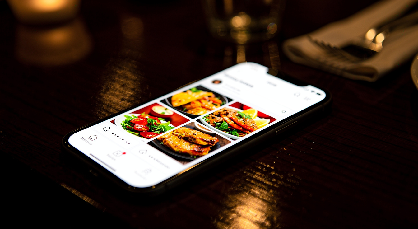
No pinch-to-zoom PDF. A real, responsive digital menu: readable on a phone, fast to scan, easy to filter for dietary needs, and editable in minutes when the kitchen changes a dish or a price.
Reservations and online ordering designed mobile-first, with the fewest taps to a confirmed table or a placed order, because every extra field is a guest you can lose at the door.
The layout is built to let great food imagery do its job. Appetite is the conversion, and the design gets out of its way.
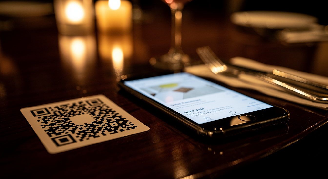 Digital menu · QR · mobile-first
 Reservations · online ordering
Anatomy of a menu 07
Diners don't read a menu top to bottom. They scan, hunt for the thing they want, and bail the second it's slow or hard to read. A converting menu is a UX problem, and these are the decisions that make or break the cover.
Restaurant marketing →Clear sections, honest hierarchy and generous touch targets so a thumb finds "entrées" in a glance. The fastest path to the dish is the whole design.
Vegetarian, gluten-free, nut-free, spicy: filterable at a tap. The guest with a restriction is the one most likely to leave when the answer is buried, and most loyal when it isn't.
86 the salmon, change a price, drop in a seasonal special. The kitchen's reality changes daily, so the menu is content the staff can update themselves, no developer required.
The right dishes shown at the right size, never so heavy the page crawls. Appetite is the conversion, and the layout lets great food imagery sell without sinking Core Web Vitals.
 Mobile menu · online ordering
 Menu design · brand fit
Better together 08
Design rarely works in isolation. Here's what most often runs alongside it.
The engineers who turn the design system into a fast, accessible, production-ready site. WordPress, React, Node and headless CMS, built to run.
Explore →Technical SEO and CRO that make sure the beautiful, fast experience also gets found, and that the traffic it earns actually converts.
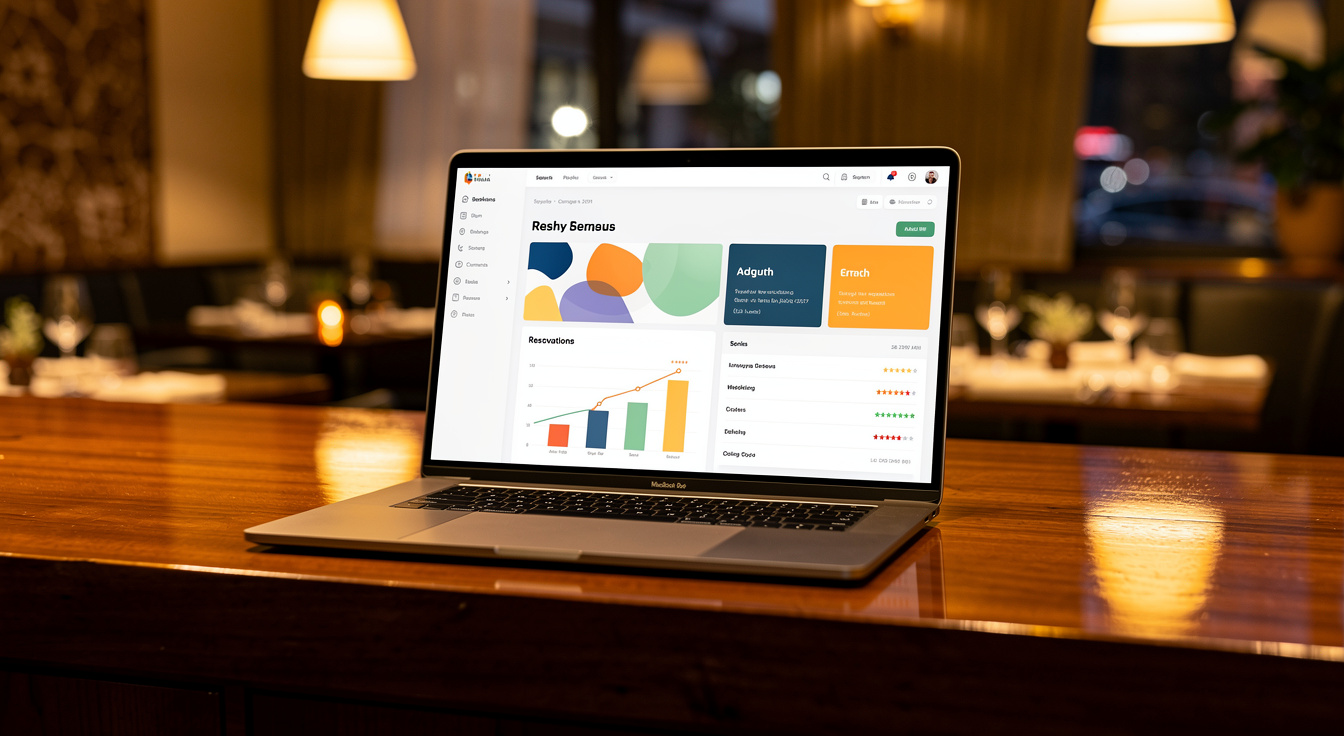
Explore →GA4, dashboards and attribution that prove what the experience is doing and tell us exactly what to refine next.
Explore →Let's talk 09
Tell us what you're building and who it's for. We'll tell you honestly where the friction is and exactly how we'd design and build it to convert.